

双语:盘点那些2013年换了logo的知名公司
 盘点那些2013年换了logo的知名公司
 盘点那些2013年换了logo的知名公司
 盘点那些2013年换了logo的知名公司
 盘点那些2013年换了logo的知名公司
 盘点那些2013年换了logo的知名公司
 盘点那些2013年换了logo的知名公司
 盘点那些2013年换了logo的知名公司
 盘点那些2013年换了logo的知名公司
 盘点那些2013年换了logo的知名公司
 盘点那些2013年换了logo的知名公司
 盘点那些2013年换了logo的知名公司
 盘点那些2013年换了logo的知名公司
 盘点那些2013年换了logo的知名公司
 盘点那些2013年换了logo的知名公司
 盘点那些2013年换了logo的知名公司
 盘点那些2013年换了logo的知名公司
 盘点那些2013年换了logo的知名公司
 盘点那些2013年换了logo的知名公司
 盘点那些2013年换了logo的知名公司
 盘点那些2013年换了logo的知名公司
 盘点那些2013年换了logo的知名公司
Did you notice that Facebook, Motorola, Procter & Gamble, and Firefox (to name a few) all changed their logos in 2013? Click here to see the 10 companies that changed their logos this year。脸谱网、摩托罗拉、宝洁、火狐(先举几个例子)在2013年都换了logo,你发现了吗?下面就来盘点今年更换了logo的十家知名公司。
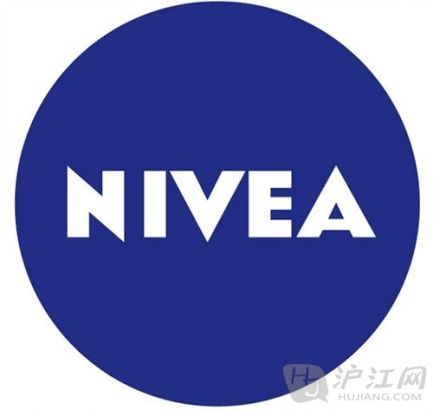
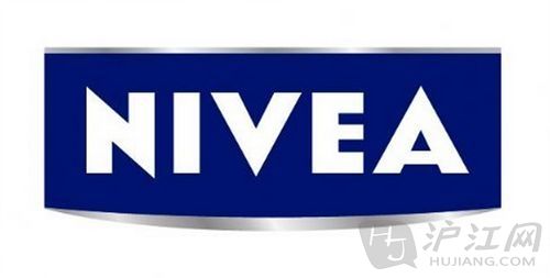
Nivea had used the following logo since 1925.妮维雅从1925年起就开始用这个logo了。
But the image changed this year。但是今年却改了logo。
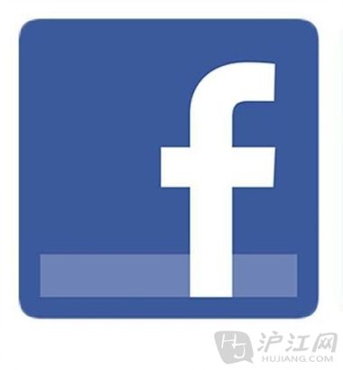
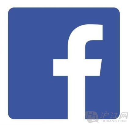
Facebook's new and old logos are almost indistinguishable. Here is the old one:脸谱网的新旧logo看起来变化不大。图上这个是旧的logo。
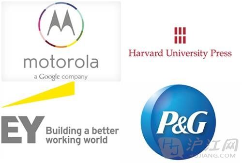
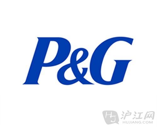
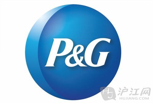
Procter & Gamble used to be pretty simple。宝洁公司原本的logo很简单。
But in May, the company decided to reintroduce the sliver of the moon that had been in previous logos since the 1850s。但是今年5月,宝洁公司打算重新设计logo,恢复使用在19世纪50年代就开始用的银色月亮的设计。
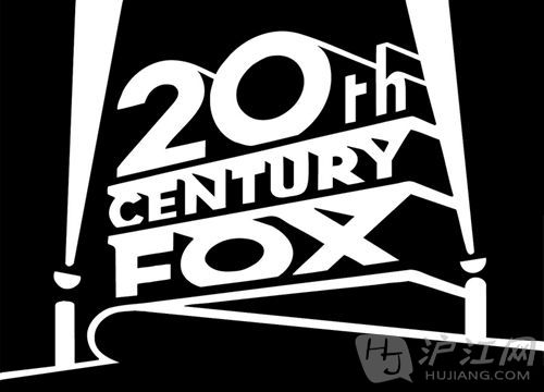
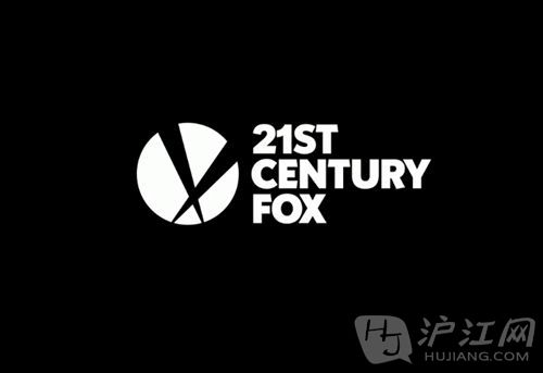
Up through May 2013, Rupert Murdoch kept his company named "20th Century Fox."直到2013年5月,默多克还是在沿用“20世纪福克斯”的公司名。
It has finally entered the 21st century。现在,它终于进入21世纪了。
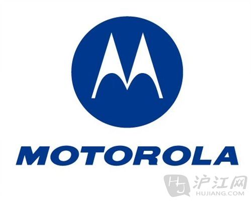
Motorola's logo used to look like this:摩托罗拉公司的logo原来是这样的:
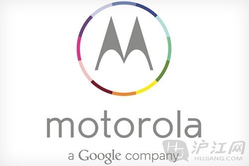
It changed to this in June. In case you missed the familiar color scheme, the bottom line reminds you that it is a Google company. The letters are also now in lowercase。今年6月,摩托罗拉也换logo了。新logo采用彩色的配色方案,还在底部加上了一行字,生怕你不知道摩托罗拉已经被谷歌收购了。同时,摩托罗拉的几个字母也全换成了小写字母。
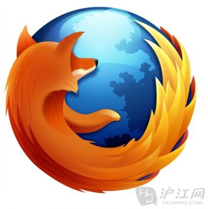
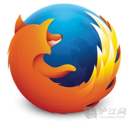
Firefox underwent a subtle logo change。火狐也微调了一下自己的logo。
It's ... virtually identical! Although designer Sean Martell gave an in-depth explanation of the changes on his blog。新旧logo看上去几乎没差别!但是设计师Sean Martell却在自己的博客中解释了新logo的深层次内涵。
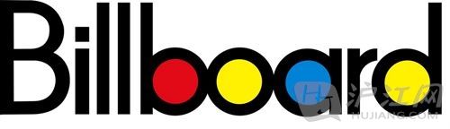
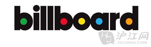
Billboard changed from uppercase .。。美国公告牌音乐榜的logo从大写字母变成了……
... to lowercase……。小写字母
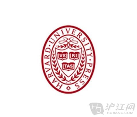
Harvard University Press' old logo had a lot of pomp and circumstance。哈佛大学出版社的旧logo中有很多华丽的装饰和背景。
The new one is pretty minimalistic. It's a series of lines. (Although the white space in between does kind of form an "H.")哈佛大学出版社的新logo看上去就卡通多了,由一系列的竖线组成(尽管线条之间形似字母“H”)。
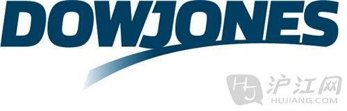
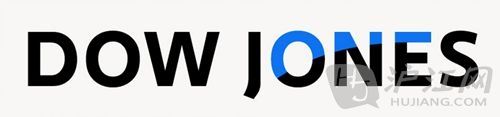
The Dow Jones switched from this closely-knit lettering .。。道琼斯的logo从原来很挤的字母排列……
... to this. The words are further apart and more colorful。变成了现在这种松散多彩的logo。
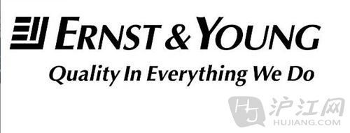
On July 1, Ernst & Young announced a logo change. Here's the old one:7月1日,安永宣布更换logo。这个是以前的logo。
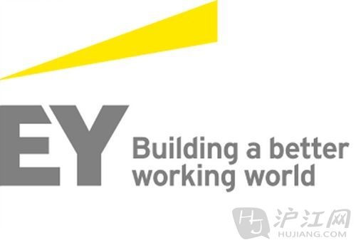
And here's the new one. In color。这个是安永的新logo,彩色的。
- 复旦师生巧用纳米技术 3微米刻校LOGO变艺术2013-06-25 08:23
- 校园关注:校庆6周年对外解读logo涵义2013-01-29 14:55
- 超内涵超邪恶的Logo图:你想歪了吗(图)2012-01-29 16:45
- 致敬乔布斯 男子跑出巨型苹果Logo(图)2011-08-29 17:49
- 谷歌特色Logo:纪念李白诞辰1310周年2011-02-28 11:01
- 中国未成年人专属网站名称和LOGO征集启事2010-04-14 16:56
- 大学生广告作品展:LOGO系列(组图)2009-04-21 16:22