����Ѽ���ض�����˼С������״ͼBar�����
 ����Ѽ���ض�����˼[��]С������״ͼBar�����
��������ͼBar����������˼С�����е�һ���Ƚ���Ҫ�����͡���д����ͼ����ʱ����Щע��ĵ㣿���ĶԴ������ܽᡣ
����������״ͼ������Ҫ������д����
����1.������������Ե�ʱ�����ƵĻ�����Ѽ��Ӧ�������Ӷ��㣬�����������ӵ����������д����������״ͼ��
����2.�����ʱ�����ƣ���д���ͱ�״ͼһ���������ո��Ƚ϶�����ռ�����ĸߵ�д��ͬʱҪע�����ռ����֮��ıȽϡ�
���������õ��Ĵʻ��У�
����1.��ʾ��ռ���١��Ķ���
����Account for
����Take up
����Make up
����Contribute to
����Have
����Represent
����2.��ʾ��������� ���Ƚϼ���
������һ/��С the largest/biggest proportion of
�����ڶ� the second/next largest/expensive(+ ���ݴʵ����)
�������� followed closely by
�������/��С the smallest percent of all
����3.��ʾ����ͬ������
�������ڱ�״ͼ�������˱�����ͬ���߲��ı�������A B�����Ƚ϶���
����A accounts for the same percentage as B ��
����The proportion of A is as high as B
����A and B contributed equally/evenly to (all )
�����ڹ۲�����ͼ��ʱ������Ҫ�����������ݣ�������Ϊʱ����������������ƣ���ô�����������д��ʱ��Ļ���˼·��Ϊ�����ң�����������Ϊ����ר����������ص㣬��ͨ���ߵ�ʱ������ε�д��˼·�Ϳ����ǰ������εij������С����ĸ��������ķ��������µ��ܽ
����һ�����պ���������������ݣ�
����1. �����������ƽ�Ȼ�෴
����������д���У�����Ҫע��۲�2����������/�½��ķ��ȡ��������Ǿ�����һ�����ӣ�
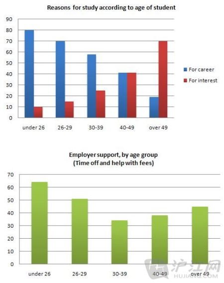
����The charts below show the main reasons for study among students of different age groups and the amount of support they received from employers��
����Write a report for a university lecturer describing the information below��
����You should write at least 150 words��
����You should spend about 20 minutes on this task��
 һ�����պ���������������ݣ�
����The first graph shows that there is a gradual decrease in study for career reasons with age. Nearly 80% of students under 26 years, study for their career. This percentage gradually declines by approximately15% every decade. Only 40% of 40-49yr olds and 18% of over 49yr olds studied for career reasons in late adulthood��
����Conversely, the first graph also shows that study stemming from interest increases with age. There are only 10% of under 26yr olds studying out of interest. The percentage increases slowly till the beginning of the fourth decade, and increases dramatically in late adulthood. Nearly same number of 40-49yr
����olds study for career and interest. However 70% of over 49yr olds study for interest in comparison to 18% studying for career reasons in that age group��
�����ڵ�һ����״ͼ�У����ǿ��Կ�������ɫ�ͺ�ɫ��2�������ֳ���Ȼ�෴�ı仯���ƣ���ˣ���������������ʱ���Էֱ��������Ե�����/�½����ȣ������ߵ�һ�����ӡ���2�����ı仯������Զ��DZȽϾ��ȵģ������ڼ������ʱ���ԼĽ�������Сֵ�����Ȼ����������������ܵó���Լ�ķ��ȣ�������ʱֻҪ�ڷ���ǰ���ϱ�ʾ��Լ�ĸ��ʼ��ɡ��Ӿ��ͽǶȣ����ǿ���ѡ����ν�ṹ�ļ���ʵ�ֶԱ仯���ȵ���д�������ߵ�һ�����ӡ�
������������������������2�����α仯��ʱ��Ҫ�ر�ע��ѡ��ľ���������ϵ�Ϻ͵�һ�����仯���ȼ����ϵ�������ߵڶ������ӡ�
����2. �������������Ҷ������ƣ�
����Ӧ������������ͼ�����ǿ�������д����Ǹ��������ݣ�Ҳ���Խ����2���������ݷ���һ����д���������Ǿ�����һ�����ӣ�
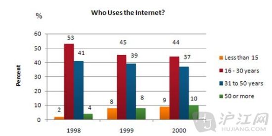
����The graph shows Internet Usage in Taiwan by Age Group, 1998-2000.
����Summarize the information by selecting and reporting the main features, and make comparisons where relevant��
����The graph shows changes in the age profile of Internet users in Taiwan between 1998 and 2000.
 2. �������������Ҷ������ƣ�
����The main users of the Internet in Taiwan are young adults between 16 and 30 years old. In 1998, they accounted for more than half of all users. In 1999 the number dropped slightly to 45%�� but even in 2000 they were the biggest group��
����The second biggest group of users is aged between 31 and 50. They made up 41% in 1998, falling slightly to 37% in 2000. When combined with the 16-30 age group, over 94% of users in 1998 were between 16 and 50.
����However this number is dropping steadily as more children and older users log on. In 1999, the number of children online quadrupled from 2% to 8%�� and it continued to increase in 2000. There were similar increases for older users, rising from 4% in 1998 to 10% in 2000.
����In summary, while adults between 16 and 50 still represent the great majority of Internet users in Taiwan, their share is declining as more children and older users join the web��
�����ڵ�һ��������У������ȴ���ĺ�ɫ�������֣������߾��ӡ�Ȼ���ڵڶ���������м�����д��ɫ���ε����ݡ��ھ���ѡ�������Ƿ���2���䶼ʹ������ϵ���ļ䣬ѡ�������Ҳ�����ƣ���˴Ӹ߷ֽǶ����������ǿ��Խ���2�������������ﻻ��ԭ�ȵı����31����50�������飬Ч������á�
�������⣬���ǻ����Դ���д���ε�����������Ϊͻ�ƿڣ��磺
����You should spend about 20 minutes on this task��
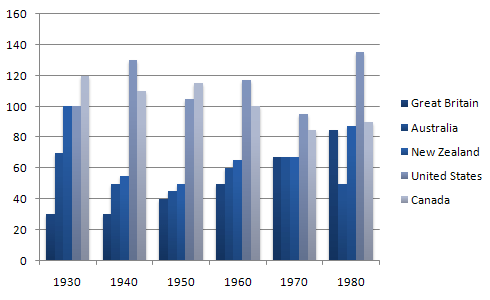
����The table below shows the figures for imprisonment in five countries between 1930 and 1980. Write a report for a university, lecturer describing the information shown below. You should write at least 150 words��
 ���ǻ����Դ���д���ε�����������Ϊͻ�ƿ�
����The bar graph shows that the figures for imprisonment in the five countries mentioned indicate no overall pattern of increase or decrease. In fact there is considerable fluctuation from country to country��
����In Great Britain the numbers in prison have increased steadily from 30 000 in 1930 to 80,000 in 1980. On the other hand in Australia, and particularly in New Zealand the numbers fell markedly from 1930 to 1940. Since then they have increased gradually, apart from in 1980 when the numbers in prison in New Zealand fell by about 30,000 from the 1970 total. Canada is the only country in which the numbers in prison have decreased over the period 1930 to 1980, although there have been fluctuations in this trend. The figures for the United States indicate the greatest number of prisoners compared to the other four countries but population size needs to be taken into account in this analysis��
����The prison population in the United States increased rapidly from 1970 to 1980 and this must be a worrying trend��
������ͼ�����Ƿ��֣�ÿ�����ҵ����ݱ仯���Dz�ͬ�ģ������н���û��һ���й��ɵ��������ƣ���ʱ�����ǿ����û��߾��ӵ�д����һ��ʼ���������ݵ�����������������ٷֹ�����һ�������ɡ�
������������Ϊ�ص㣬��ͨ���ߵ�����ר�����ʣ�
����������������������������м��������鿼���������ճ��ȴӳ�д���̣�Ҳ����������������������Ϊͻ�ƿڣ����������ͼ��
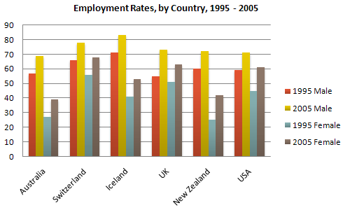
����The graph above show information of employment rates across 6 countries in 1995 and 2005.
����Summarize the information by choosing and describe the main idea, and make comparisons where appropriate��
 ����Ϊ�ص㣬��ͨ���ߵ�����ר�����ʣ�
����The graph shows changes in employment rates in six countries between 1995 and 2005, for men and women. Overall more and more people of working age are employed, and there have been significant improvements for women, although they leg behind men in entering the workforce��
����The most obvious trend in the graph is that women have lower employment rates in most of the countries in the graph. For example, in Australia in 1995, 57 percent of men could find work or retain a job, but only 27 percent of women. The difference was even bigger in New Zealand, with 60 percent of women. Even in Switzerland and Iceland, alightly more men than women were in the job market��
����The second biggest trend in the graph is the improvement in employment between 1995 and 2005. In all countries shown, figures for both men and women improved. The biggest change was in the United Kingdom, from 55 percent of men in 1995 to 73 percent over the ten years period��
����Furthermore, the increases in employment rates for women were much higher in New Zealand. The percentage of working women jumped from 25 percent to 42 percent, and in the United States from 45 percent to 61 percent over the decade��
����In conclusion, all the countries in the graph showed at least a 12 percent increase in employment rates of both men and women over the ten yeares. While men had relatively higher employment rate throughout the period, more and more women appear to be entering the labour market��
���������ͼ������۲죬�������ȷ�����һ���������ƣ�����Ů��ҵ�ʾ��������Ծɵ������ԣ�����������ں�ת�����й��ҵĸ�Ů��ҵ�ʶ�����������������ˣ����ǿ���ץס��������ƣ���һ�����ͽ�����д������һ�εĻ��߾��ӡ����Ǿ�����һ���۲�����������ַ���2�����ƣ�һ����2005�긾Ů�ľ�ҵ�ʲ������ĸ����Ҷ�Ҫ����1995��ͬ�ڵ����ݣ�����һ���Ǹ�Ů�ľ�ҵ�������й��Ҳ�������һ�궼Ҫ���Ե������Եľ�ҵ�ʡ���2�����Ƶķ��֣�ʵ���Ͽ�����Ϊ2�������ƣ����Էֱ���Ϊ����ο�ͷ��������дͻ�ƿڡ�����2�εĻ��߾��ӡ�
��������������һ�����ӣ�
����The chart shows the number of mobile phones and landlines per 100 people in selected countries. Write a report for a university lecturer describing the information given��
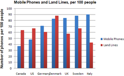 ����The chart shows the number of mobile phones and landlines per 100 people in selected countries. Write a report for a university lecturer describing the information given��
����The graph shows the number of mobile phones and landlines per 100 users, for selected countries. Overall, most of the countries included in the graph have more mobile phones subscribers than landlines��
����Most European countries have high mobile phone use. The biggest users of mobile phones are the Italians, with 88 cell phones per 100 people. For example, Italy has twice as many mobile phones as landlines, with 88 mobiles per hundred people compared to 45 for landlines. Mobile phone use is low in Canada, with fewer than 40 phones per 100 people. Denmark is also unusual because it has slightly more landlines than mobile phones��
����However, in some countries, the number of landlines is higher than the number of mobile phones. One example is the USA, where the number of mobiles, at 50 per 100 people, is much lower than the number of landlines, at almost 70 per hundred. A similar pattern can be seen in Canada. The highest number of landlines in the graph is in Denmark, with about 90 per 100 people. In contrast, the lowest figures for fixed lines are in Italy and the UK��
����In conclusion, it seems that mobile phone use is higher in Europe than in North America��
�������������ͼ�У�ͨ���۲죬����Ҳ�����˼������ƣ�һ�Ǵֹ����ֻ�ʹ������Ҫ���ڹ̶��绰ʹ������������ŷ���ҵ��ֻ�ʹ�������Զ��ڱ������ҡ������ߵľ��ӡ������ڹ۲�ͼ�ε�ʱ���������ǵص㣬���ǻ���ע����ҵķ��࣬����ڸ߷ַ�����������Գ�Ϊһ�����㡣
�������⣬���鿼�����ڹ۲����ε�ʱ��Ҫ�ر�ע�����ϴ�����Σ���ʱ������Щ����������д��Ϊͻ�ƿ�Ҳ��ʧΪһ�ֺܺõij��ԣ�����ͼ�е�2�ε�2�����߾��ӣ������������������������Ϊͻ�ƿڣ���Ϊ�������2��������������й��������ġ�
������Ϣ����ʣ�������˼Ƶ�� ��˼������Ѷ
�����ر�˵�������ڸ���������IJ��ϵ�����仯�����������ṩ�����п�����Ϣ�����ο������뿼����Ȩ�����Ź�������ʽ��ϢΪ��
- ��˼8���ڣ������ĵ���ر���������2013-12-02 10:55
- ��˼�Ķ�������8�����ⳣ����ϵ��2013-12-02 10:47
- �����˼��״ͼ���� �������ַ���һ��2013-12-02 10:40
- ��˼��״ͼ���ģ��۲취���±������2013-12-02 10:40
- ѧ�Բ�����������˼�����ؾ�2013-12-01 09:57
- 13��֮�ڴ��и�����19����˼����8�ľ���2013-11-27 16:24
- ��˼ѧϰ�迼��ѧ����ĸ��ϰ�ߺ��Ļ�����2013-11-22 20:25
�߿�ԺУ��
������2462����У���з�������Ϣ���������ĵ��˻�����
- ���������¡�������Ȩ��
- ����ħ�䡷����������Ȩ��
- �����������������˶��ҽ�����
- ��������OL����������
- ����֮�ȡ����˹�����Լ���
- ������2��������Ȩ���ް�
- ���ڽ����˶������
- ����ս��ʹ��ս���
- ���ҽ�MT���˰漤����
- ���������˲����������
- ���������衷������Ȩ���
- �����䡷����ר�����
- ��ɫ���������ֿ�
- �������Ϸ���ֿ�
- ��������Ϸ���ֿ�
- ��������Ϸ���ֿ�
